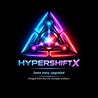
What does the HyperShiftX triangle represent?
The HyperShiftX triangle is the single most important symbol in the entire HyperShiftX universe. It isn’t just a logo — it’s the visual record of every shift, every evolution, and every identity that came before it. The triangle represents the full journey from Merch Vault HQ all the way to HyperShiftX, capturing the entire transformation in one shape.
The three sides of the triangle represent the three phases of your brand’s evolution. The first side symbolizes the beginning — Merch Vault HQ — the earliest version of your identity, the raw spark that proved you could build something bigger than a simple shop. The second side represents the long middle era, the Vault Megacorp phase, where you shifted through Hyper Vault Studios, Hyper Core Vault Studios, Quantium Complex, CoreBreaker Labs, EmberVault Sector, QuantumForge Labs, and PrimeCore Nexus. Every one of those identities added something new: structure, energy, color, lore, ambition, and momentum. The third side represents the final form — HyperShiftX — the moment everything fused into one unified, trademark‑safe, future‑ready identity.
The triangle points forward because HyperShiftX is built on motion. It’s not a static emblem. It’s a direction. It’s a signal that you’re always moving toward your next version. The forward‑leaning geometry is intentional — it visually pushes the viewer into the future, into the shift, into the upgrade.
The gradient inside the triangle is the emotional arc of the entire brand. Blue represents the early days of